Project type
UX & UI design
System design
System design
Roles
UX & Visual designer
The problem
The methodology of accessibility design used by design practitioners at IBM was not sustainable. Accessibility requirements and best practices are not prioritized by product teams.
Team Canadian Bacon
Kate Moon User Research
Rachel Chen UX Designer
Ajay Rayasam Offering Manager
Gene Hu Offering Manager
Josefina Mancilla Front-End Developer
Rachel Chen UX Designer
Ajay Rayasam Offering Manager
Gene Hu Offering Manager
Josefina Mancilla Front-End Developer
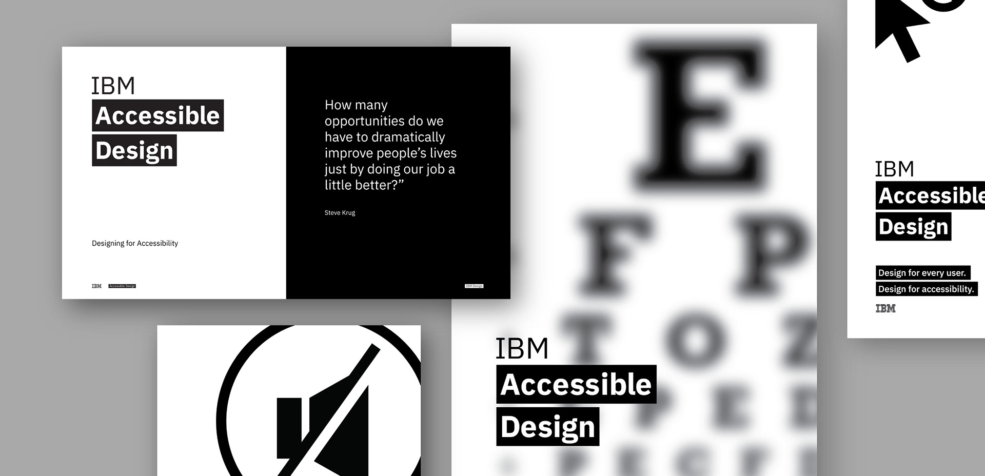
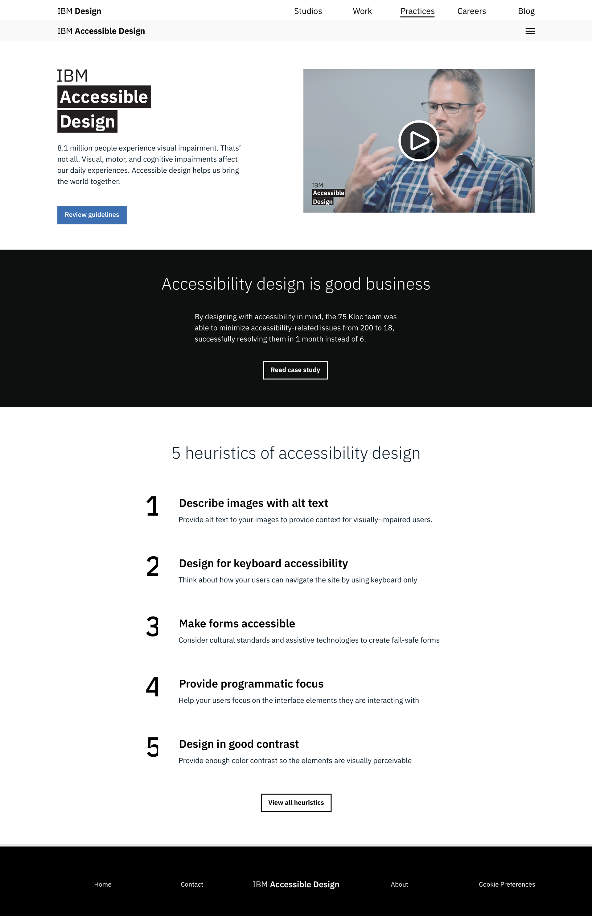
Promotional content for accessible design at IBM.
Background
Giddy-up partner.
Each summer IBM Design conducts an intensive ten-week design internship program where designers and offering managers are tasked to solve some of IBM's pressing problems. Our multi-disciplinary team of six was asked only one question.
"How might IBM create a framework to empower its IBMers to create beautiful, inclusive, and accessible products?"
Research
Identifying the problem.
Over the past century, IBM has been on the fore-front of inclusivity. They’ve valued and appreciate people of all backgrounds and ability, but at the time of our research we found that only 47% of IBM's product offerings pass standard accessibility guidelines.
We initially conducted secondary research to establish a baseline of knowledge in the problem space.
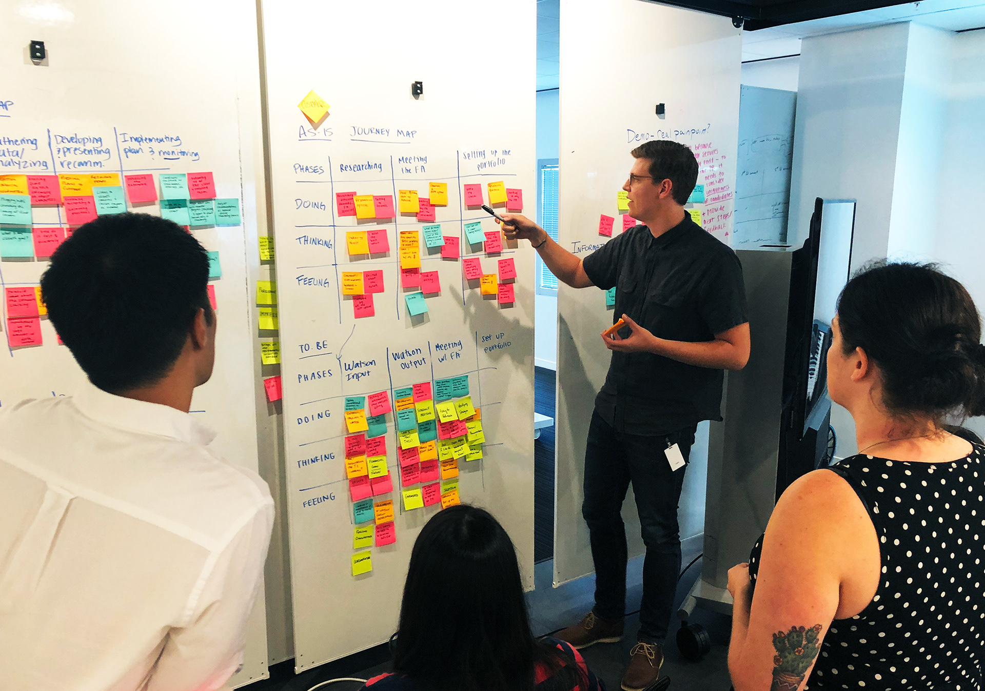
Presenting findings from a design thinking exercise.
Interviews
We conducted 14 interviews with stakeholders, sponsor users and target users to better understand how accessibility currently does (or does not) get done at IBM.
Workshop
We conducted a process mapping workshop with users who hold various roles on product teams. This validated our hunch that the bulk of accessibility work often happens late in the design process.
Survey
We surveyed 107 members of product teams to learn how familiar they were with accessibility tools and practices. The majority were unaware of or had never used the IBM accessibility resources.
Critical Findings
The important stuff we learned.
Based on our research efforts we found the following to be the most pressing issues that product teams face when considering accessible design.
- Accessibility design can be very technical with many complex rules to adhere to.
- Designers and developers often care about accessibility, but don't feel empowered to do anything about it.
- IBM and others provide information and guidance, but it is hard to find these resources and often harder to interpret.
- Offering Managers tend to prioritize things that will make an immediate mark on profitability, so accessibility often gets de-prioritized.
We identified 2 major problems large corporations might encounter in accessible products are disregarded.
1. By releasing products and services that are not accessible, IBM could be excluding 20% of American population from benefiting. The financial and humanitarian implications are huge.
2. By not incorporating accessibility early on in the creation process, product teams may suffer when accessible features have to be included. This often leads to last-minute reworks, which are costly.
Everyone thinks I know what I'm doing [when to comes to accessibility], but there's so very little guidance.
IBM Designer
IBM Designer
Goals
In order to measure the success of our solutions and align our team on a common direction, we crafted 2 primary use case goals we wanted any designer to be able to accomplish.
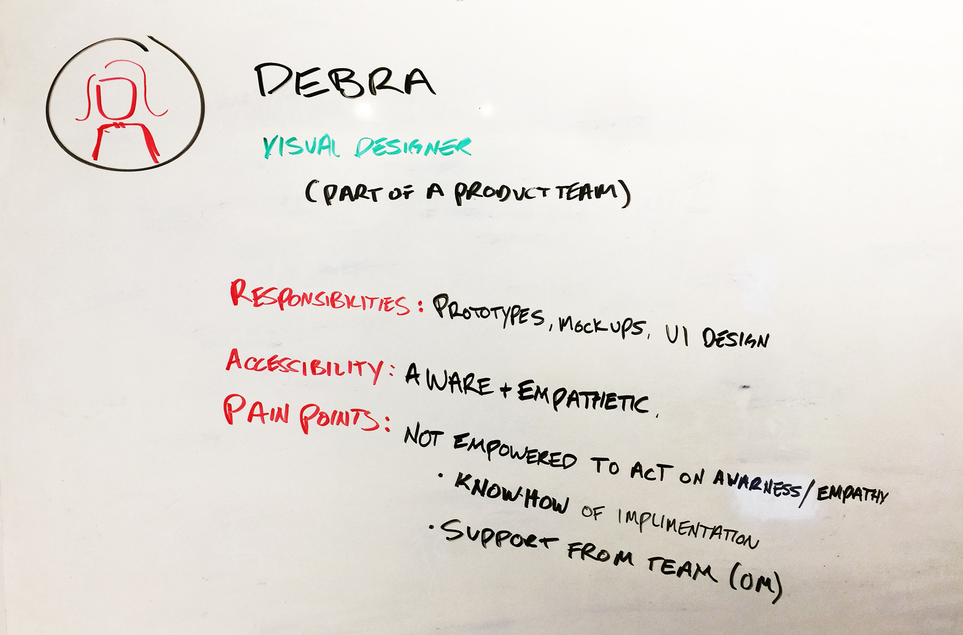
Sketching out a persona.
1. Debra, a Designer, can find all the relevant information to create accessible interfaces within a single resource.
Particularly, a single resource is important. When Debra has to switch from resource to resource, it becomes tiresome and confusing. The content Debra finds should be actionable for the task she is trying to complete.
2. Debra, a Designer, will create accessible designs throughout her design process, reducing the severity and frequency of accessibility reworks.
If Debra can front-load accessibility, she will reduce the amount of time-consuming rework she and her developers must do later.
Prototyping
Let's get Accessible.
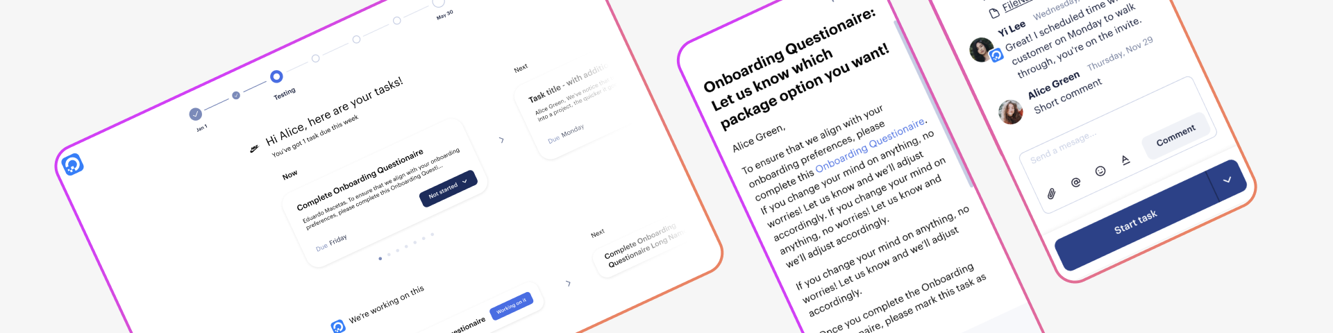
After our initial round of research, we pushed forward with a plan to create a central location for users to find all the information IBM product teams would need to create accessible products. This new site would serve three main purposes, to break down the complexity of accessibility, give actionable direction, and promote its users to become accessibility advocates.
It would do this by give basic starting tips, separate information into role-specific sections, and provide resources for IBMers to share and influence their teams.
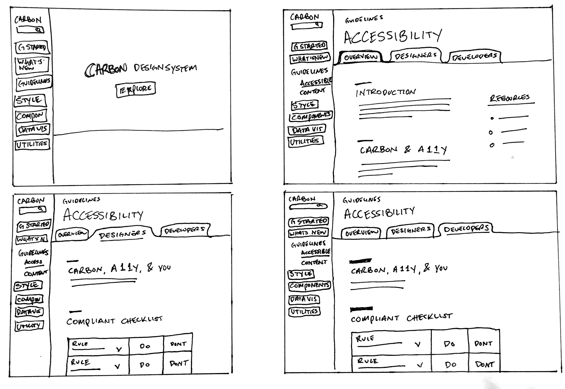
Mid-Fidelity wireframes for an IBM Accessible Design site.
Pivot
Informed direction change.
Through continued user research, we came to the realization that adding yet another "helpful" website to bookmark was not going to solve the problem. It was a this point we finally were able to look past our own assumptions and listen to the user.
When I have a question, I refer to the Carbon website the most.
IBM Designer
IBM Designer
Given that our designed solution should fit with their workflow (so designers would not have to go out of their way to use the tool or acquire the information), we decided to leverage the Carbon Design System. Carbon is now the primary design system that all product teams at IBM use, but at this time and due to IBM's shear size, its adoption was limited.
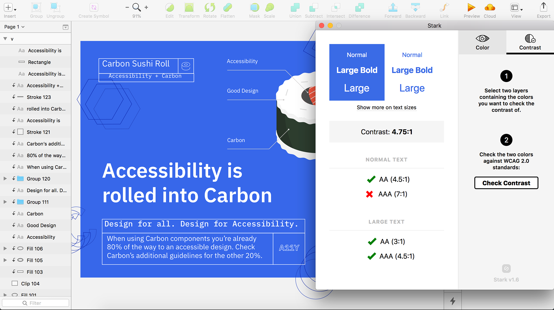
While Carbon has integrated many accessibility standards into their components (such as color contrast and icon sizing), how designers use Carbon can affect the accessibility of their final deliverables.
It is important for designers to understand how to use them appropriately. So we adjusted our solution to be an add-on to the existing Carbon site that helps designers create accessible products. We also wanted to raise awareness that Carbon has already taken accessibility into consideration, which would help with adoption.
Sketches exploring how to improve the current accessibility information in the Carbon Design System.
Usability feedback
Throughout the prototyping phase we tested our designs with users and adjusted accordingly.
We conducted three contextual interviews with designers who use Carbon so we could observe their search behavior and better understand how the Carbon website fits into their workflow. When looking for accessibility information, they started at Carbon but all ended up clicking through multiple links to other resources, backtracking, and finally Googling answers.- User's were often trying to find accessibility information on the exact component they were looking to use. This lead us to believe that accessibility should be more explicitly called out for each component and style pages, and not only on a single "Accessibility" page.
Additional findings suggested that users also sought out examples of what to do and what not to do, and that some developers, especially those who were new to Carbon, hesitated to trust that the accessibility work had been implemented into the components.
Final Solution
Implementation.
We started to work closely with the Carbon Design System team to implement our findings, as well as in-depth content, into their site. Grateful to have our support, we worked to create additional guidelines, designs, examples, and information that could easily be implemented to their site.
Within weeks of ending our internship, the Carbon Design site had merged in a large majority of our suggestions, edits, and designs. User's now had the ability to quickly and conveniently find pertinent accessibility information within their current workflow. This reduced the likelihood of products not passing accessibility standards, and ultimately leaving less rework.
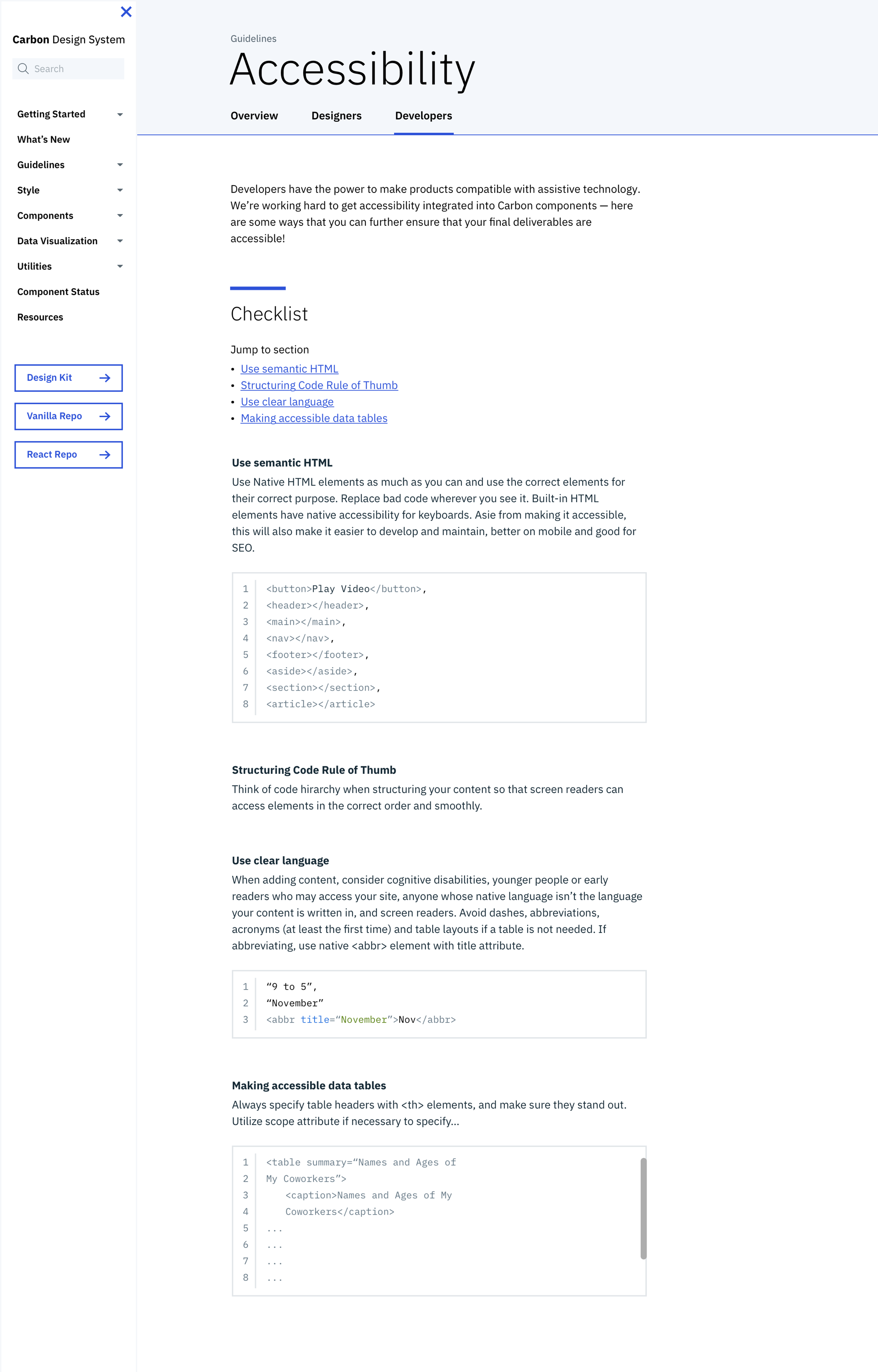
We made a point to include information for developers as well.
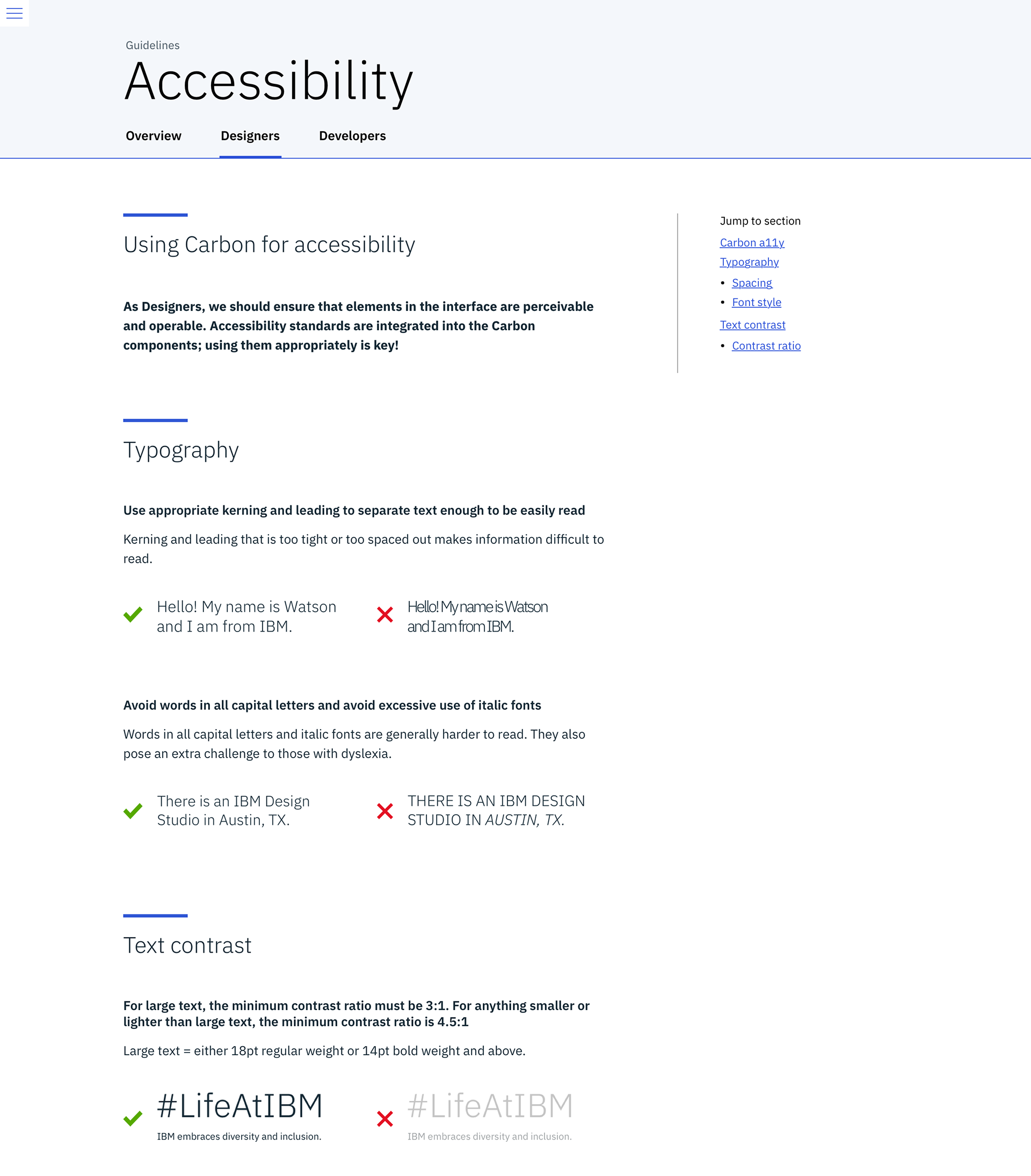
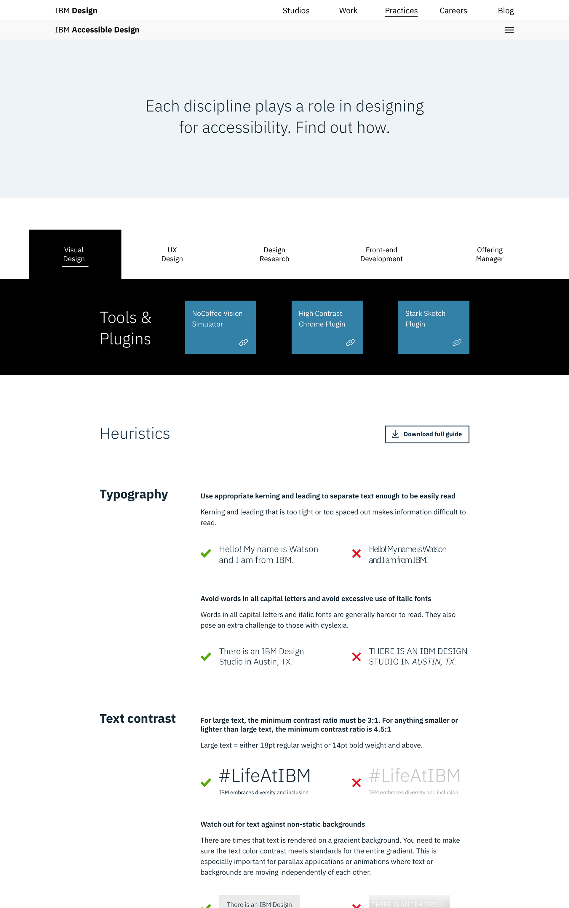
Highlighting general designer, "do's" and "don'ts", for accessibility.
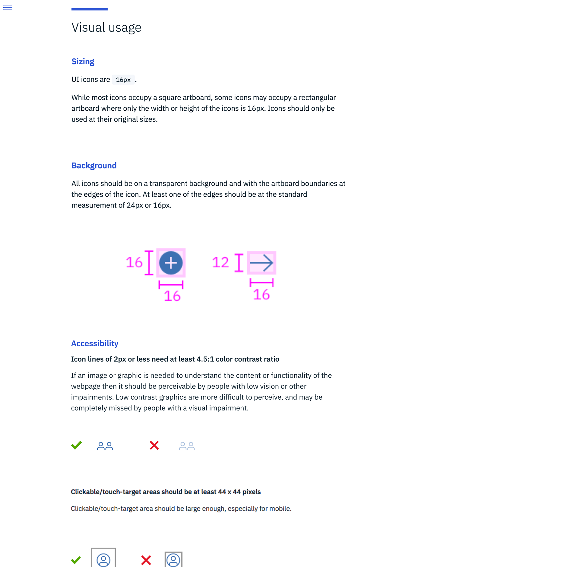
Accessibility content was placed directly in context. When looking at icons, users could see all the guidance they needed.
Carbon and Accessibility is a good a thing.
We payed close attention to the accessibility of all the solutions we made.
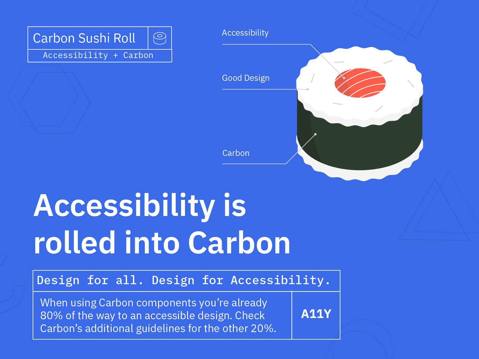
Promotional video we directed to increase awareness and empathy around accessibility.
Conclusion
Looking at how we did.
By meeting more of the accessibility resource criteria that designers look for; our Carbon Accessibility page redesign effectively allows users to access information within a single source.
The new Carbon content provides users with comprehensive and role-specific knowledge that is easily understandable, concrete examples that are actionable, and more importantly, when users start using Carbon components, our solution will meet them where they work.
Changing directions part way into the process was difficult, we no longer were able to create a "cool" new site with everything we wanted, but rather, we were able to create a resource that the user needed.
Future considerations
Given the length of time to complete the project, we are unable to monitor how this solution plays a role throughout the user's design process. We would have tested this by seeing how designers who work in Carbon utilize the information we provide on the site, and measuring the severity and frequency of accessibility reworks that take place.